2D Plots#
The default method DataArray.plot() calls xarray.plot.pcolormesh()
by default when the data is two-dimensional.
import cartopy.crs as ccrs
import matplotlib.pyplot as plt
import numpy as np
import pandas as pd
import xarray as xr
# Load example data
airtemps = xr.tutorial.open_dataset("air_temperature")
air = airtemps.air - 273.15
air.attrs = airtemps.air.attrs
air.attrs["units"] = "deg C"
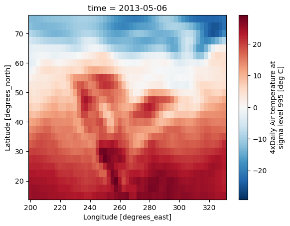
air2d = air.isel(time=500)
air2d.plot();

All 2d plots in xarray allow the use of the keyword arguments yincrease
and xincrease.
air2d.plot(yincrease=False);
Note
We use xarray.plot.pcolormesh() as the default two-dimensional plot
method because it is more flexible than xarray.plot.imshow().
However, for large arrays, imshow can be much faster than pcolormesh.
If speed is important to you and you are plotting a regular mesh, consider
using imshow.
Coordinate Handling#
If you’d like to find out what’s really going on in the coordinate system, read on.
a0 = xr.DataArray(np.zeros((4, 3, 2)), dims=("y", "x", "z"), name="temperature")
a0[0, 0, 0] = 1
a = a0.isel(z=0)
a
<xarray.DataArray 'temperature' (y: 4, x: 3)> Size: 96B
array([[1., 0., 0.],
       [0., 0., 0.],
       [0., 0., 0.],
       [0., 0., 0.]])
Dimensions without coordinates: y, xThe plot will produce an image corresponding to the values of the array. Hence the top left pixel will be a different color than the others. Before reading on, you may want to look at the coordinates and think carefully about what the limits, labels, and orientation for each of the axes should be.
a.plot();
It may seem strange that the values on the y axis are decreasing with -0.5 on the top. This is because the pixels are centered over their coordinates, and the axis labels and ranges correspond to the values of the coordinates.
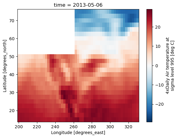
Missing Values#
Xarray plots data with Missing values.
bad_air2d = air2d.copy()
bad_air2d[dict(lat=slice(0, 10), lon=slice(0, 25))] = np.nan
bad_air2d.plot();
Nonuniform Coordinates#
It’s not necessary for the coordinates to be evenly spaced. Both
xarray.plot.pcolormesh() (default) and xarray.plot.contourf() can
produce plots with nonuniform coordinates.
b = air2d.copy()
# Apply a nonlinear transformation to one of the coords
b.coords["lat"] = np.log(b.coords["lat"])

b.plot();
Other types of plot#
There are several other options for plotting 2D data.
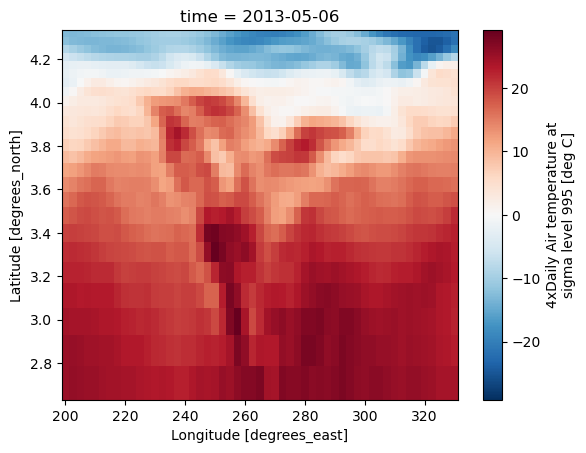
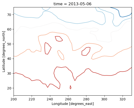
Contour plot using DataArray.plot.contour()
air2d.plot.contour();
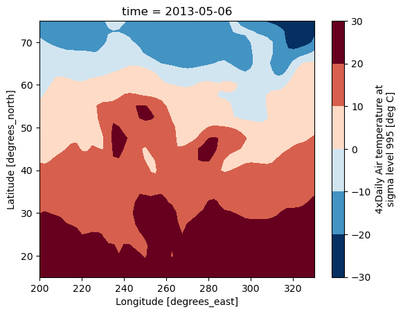
Filled contour plot using DataArray.plot.contourf()
air2d.plot.contourf();
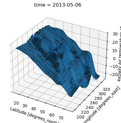
Surface plot using DataArray.plot.surface()
# transpose just to make the example look a bit nicer
air2d.T.plot.surface();
Calling Matplotlib#
Since this is a thin wrapper around matplotlib, all the functionality of matplotlib is available.
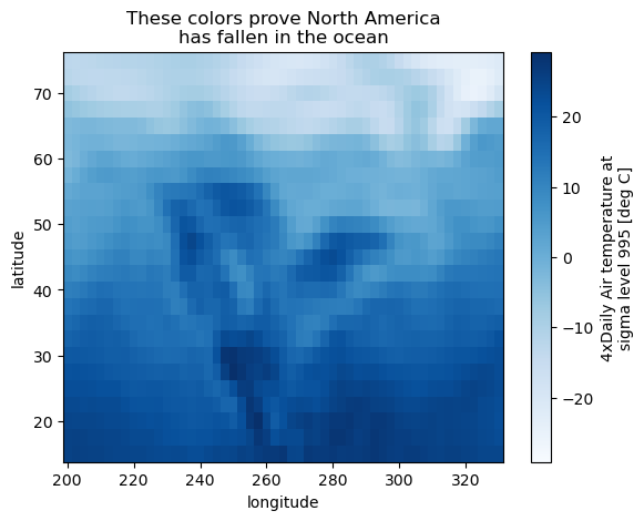
air2d.plot(cmap=plt.cm.Blues)
plt.title("These colors prove North America\nhas fallen in the ocean")
plt.ylabel("latitude")
plt.xlabel("longitude");
Note
Xarray methods update label information and generally play around with the
axes. So any kind of updates to the plot
should be done after the call to the xarray’s plot.
In the example below, plt.xlabel effectively does nothing, since
d_ylog.plot() updates the xlabel.
plt.xlabel("Never gonna see this.")
air2d.plot();
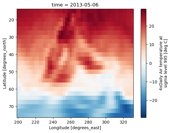
Colormaps#
Xarray borrows logic from Seaborn to infer what kind of color map to use. For example, consider the original data in Kelvins rather than Celsius:
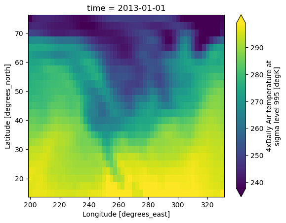
airtemps.air.isel(time=0).plot();
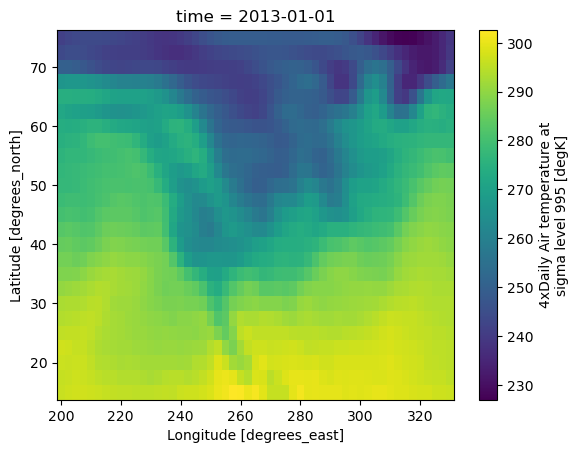
The Celsius data contain 0, so a diverging color map was used. The Kelvins do not have 0, so the default color map was used.
Robust#
Outliers often have an extreme effect on the output of the plot. Here we add two bad data points. This affects the color scale, washing out the plot.
air_outliers = airtemps.air.isel(time=0).copy()
air_outliers[0, 0] = 100
air_outliers[-1, -1] = 400

air_outliers.plot();
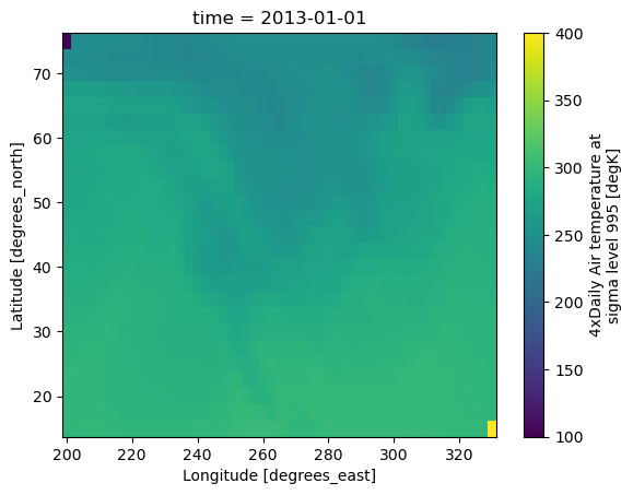
This plot shows that we have outliers. The easy way to visualize
the data without the outliers is to pass the parameter
robust=True.
This will use the 2nd and 98th
percentiles of the data to compute the color limits.
air_outliers.plot(robust=True);
Observe that the ranges of the color bar have changed. The arrows on the color bar indicate that the colors include data points outside the bounds.
Discrete Colormaps#
It is often useful, when visualizing 2d data, to use a discrete colormap,
rather than the default continuous colormaps that matplotlib uses. The
levels keyword argument can be used to generate plots with discrete
colormaps. For example, to make a plot with 8 discrete color intervals:
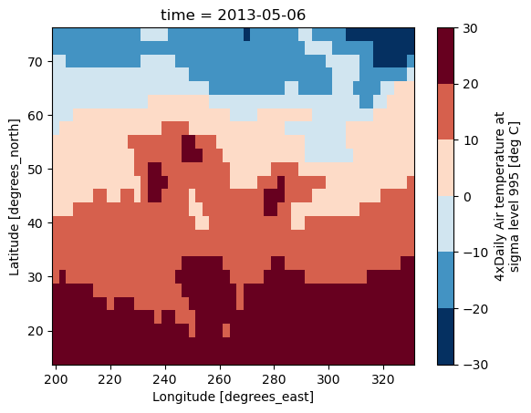
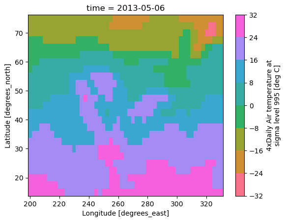
air2d.plot(levels=8);
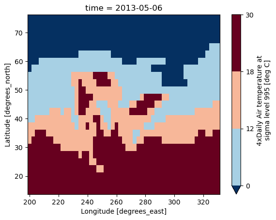
It is also possible to use a list of levels to specify the boundaries of the discrete colormap:
air2d.plot(levels=[0, 12, 18, 30]);
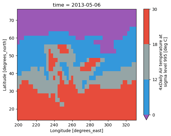
You can also specify a list of discrete colors through the colors argument:
flatui = ["#9b59b6", "#3498db", "#95a5a6", "#e74c3c", "#34495e", "#2ecc71"]
air2d.plot(levels=[0, 12, 18, 30], colors=flatui);
Finally, if you have Seaborn
installed, you can also specify a seaborn color palette to the cmap
argument. Note that levels must be specified with seaborn color palettes
if using imshow or pcolormesh (but not with contour or contourf,
since levels are chosen automatically).
air2d.plot(levels=10, cmap="husl");
Multidimensional coordinates#
See also: Working with Multidimensional Coordinates.
You can plot irregular grids defined by multidimensional coordinates with xarray, but you’ll have to tell the plot function to use these coordinates instead of the default ones:
lon, lat = np.meshgrid(np.linspace(-20, 20, 5), np.linspace(0, 30, 4))
lon += lat / 10
lat += lon / 10
da = xr.DataArray(
    np.arange(20).reshape(4, 5),
    dims=["y", "x"],
    coords={"lat": (("y", "x"), lat), "lon": (("y", "x"), lon)},
)

da.plot.pcolormesh(x="lon", y="lat");
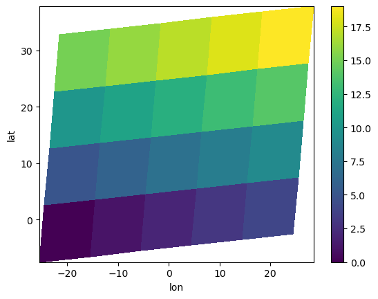
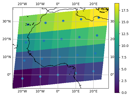
Note that in this case, xarray still follows the pixel centered convention:
ax = plt.subplot(projection=ccrs.PlateCarree())
da.plot.pcolormesh(x="lon", y="lat", ax=ax)
ax.scatter(lon, lat, transform=ccrs.PlateCarree())
ax.coastlines()
ax.gridlines(draw_labels=True);
/home/docs/checkouts/readthedocs.org/user_builds/xray/conda/10526/lib/python3.13/site-packages/cartopy/io/__init__.py:241: DownloadWarning: Downloading: https://naturalearth.s3.amazonaws.com/50m_physical/ne_50m_coastline.zip
  warnings.warn(f'Downloading: {url}', DownloadWarning)
Note
The data model of xarray does not support datasets with cell boundaries yet. If you want to use these coordinates, you’ll have to make the plots outside the xarray framework.
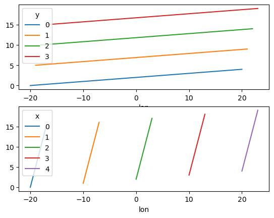
One can also make line plots with multidimensional coordinates. In this case, hue must be a dimension name, not a coordinate name.
f, ax = plt.subplots(2, 1)
da.plot.line(x="lon", hue="y", ax=ax[0])
da.plot.line(x="lon", hue="x", ax=ax[1]);
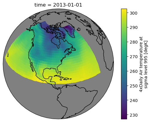
Maps#
To follow this section you’ll need to have Cartopy installed and working.
This script will plot the air temperature on a map.
air = xr.tutorial.open_dataset("air_temperature").air

p = air.isel(time=0).plot(
    subplot_kws=dict(projection=ccrs.Orthographic(-80, 35), facecolor="gray"),
    transform=ccrs.PlateCarree(),
)
p.axes.set_global()

p.axes.coastlines();
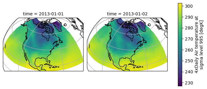
When faceting on maps, the projection can be transferred to the plot
function using the subplot_kws keyword. The axes for the subplots created
by faceting are accessible in the object returned by plot:
p = air.isel(time=[0, 4]).plot(
    transform=ccrs.PlateCarree(),
    col="time",
    subplot_kws={"projection": ccrs.Orthographic(-80, 35)},
)
for ax in p.axs.flat:
    ax.coastlines()
    ax.gridlines()