Dataset Plotting#
Xarray has limited support for plotting Dataset variables against each other. Consider this dataset
import matplotlib.pyplot as plt
from mpl_toolkits.mplot3d import Axes3D
import numpy as np
import pandas as pd
import xarray as xr
%matplotlib inline

# Load air temperature dataset (needed for complete context)
airtemps = xr.tutorial.open_dataset("air_temperature")

# Convert to celsius
air = airtemps.air - 273.15

# copy attributes to get nice figure labels and change Kelvin to Celsius
air.attrs = airtemps.air.attrs
air.attrs["units"] = "deg C"

ds = xr.tutorial.scatter_example_dataset(seed=42)
ds
<xarray.Dataset> Size: 9kB
Dimensions:  (x: 3, y: 11, z: 4, w: 4)
Coordinates:
  * x        (x) int64 24B 0 1 2
  * y        (y) float64 88B 0.0 0.1 0.2 0.3 0.4 0.5 0.6 0.7 0.8 0.9 1.0
  * z        (z) int64 32B 0 1 2 3
  * w        (w) <U5 80B 'one' 'two' 'three' 'five'
Data variables:
    A        (x, y, z, w) float64 4kB 0.03047 -0.104 ... 4.512e-05 0.01906
B (x, y, z, w) float64 4kB 0.0 0.0 0.0 0.0 ... 1.369 1.423 1.428Scatter#
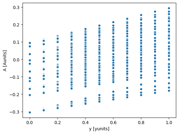
Let’s plot the A DataArray as a function of the y coord
with xr.set_options(display_expand_data=False):
    display(ds.A)
<xarray.DataArray 'A' (x: 3, y: 11, z: 4, w: 4)> Size: 4kB
0.03047 -0.104 0.07505 0.09406 0.03047 ... -0.04453 -0.179 4.512e-05 0.01906
Coordinates:
  * x        (x) int64 24B 0 1 2
  * y        (y) float64 88B 0.0 0.1 0.2 0.3 0.4 0.5 0.6 0.7 0.8 0.9 1.0
  * z        (z) int64 32B 0 1 2 3
  * w        (w) <U5 80B 'one' 'two' 'three' 'five'
Attributes:
units: Aunitsds.A.plot.scatter(x="y");

Same plot can be displayed using the dataset:
ds.plot.scatter(x="y", y="A");
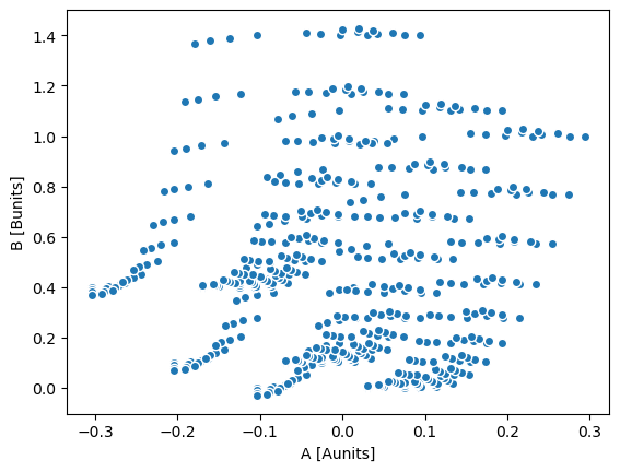
Now suppose we want to scatter the A DataArray against the B DataArray
ds.plot.scatter(x="A", y="B");
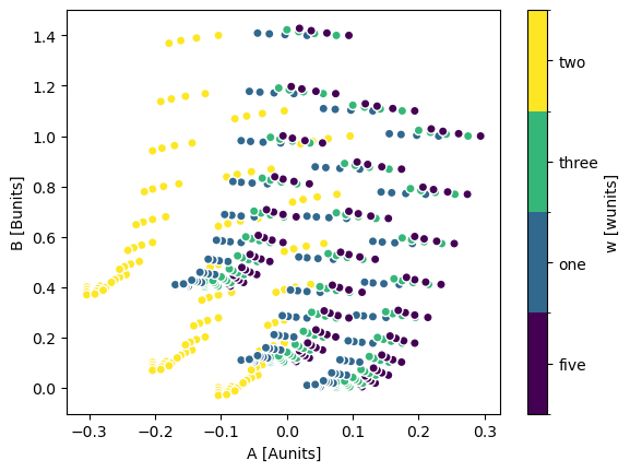
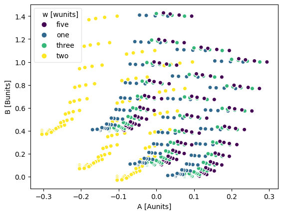
The hue kwarg lets you vary the color by variable value
ds.plot.scatter(x="A", y="B", hue="w");
You can force a legend instead of a colorbar by setting add_legend=True, add_colorbar=False.
ds.plot.scatter(x="A", y="B", hue="w", add_legend=True, add_colorbar=False);
ds.plot.scatter(x="A", y="B", hue="w", add_legend=False, add_colorbar=True);

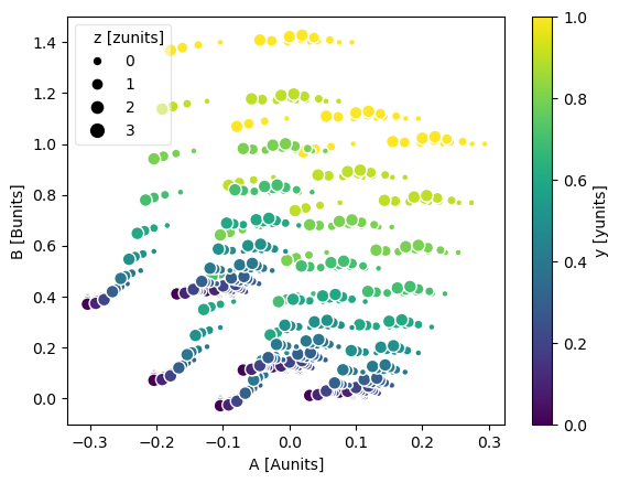
The markersize kwarg lets you vary the point’s size by variable value.
You can additionally pass size_norm to control how the variable’s values are mapped to point sizes.
ds.plot.scatter(x="A", y="B", hue="y", markersize="z");
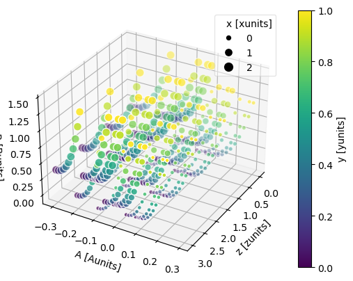
The z kwarg lets you plot the data along the z-axis as well.
ds.plot.scatter(x="A", y="B", z="z", hue="y", markersize="x");
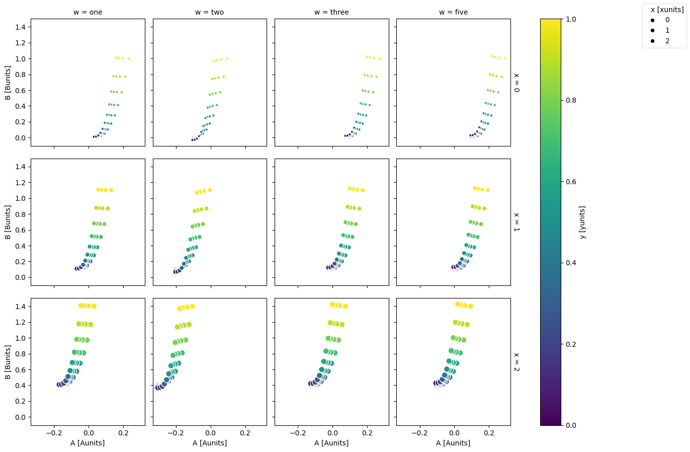
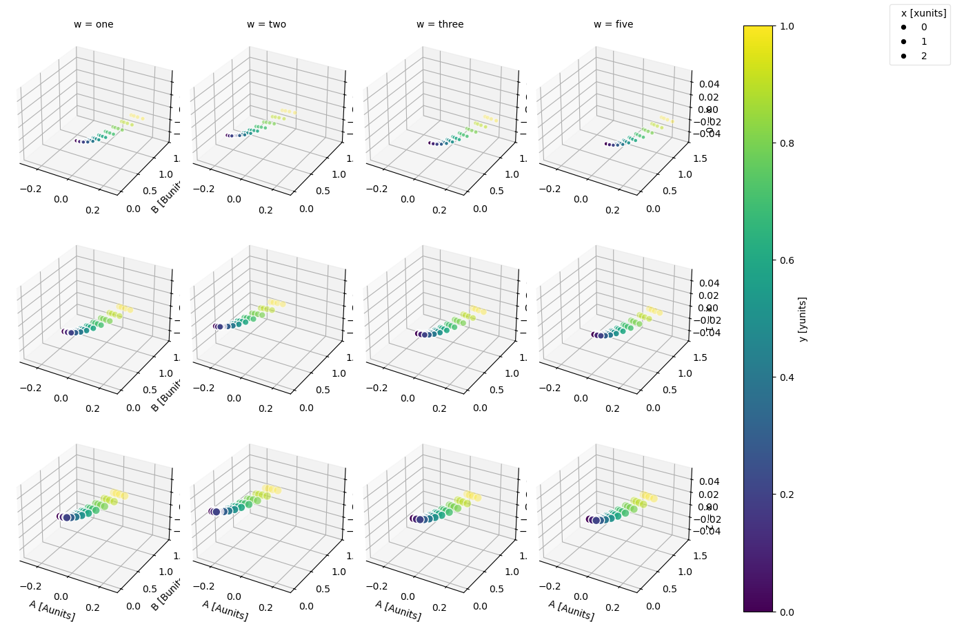
Faceting is also possible
ds.plot.scatter(x="A", y="B", hue="y", markersize="x", row="x", col="w");
And adding the z-axis
ds.plot.scatter(x="A", y="B", z="z", hue="y", markersize="x", row="x", col="w");
For more advanced scatter plots, we recommend converting the relevant data variables
to a pandas DataFrame and using the extensive plotting capabilities of seaborn.
Quiver#
Visualizing vector fields is supported with quiver plots:
ds.isel(w=1, z=1).plot.quiver(x="x", y="y", u="A", v="B");
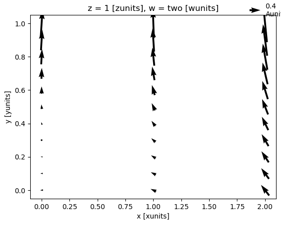
where u and v denote the x and y direction components of the arrow vectors. Again, faceting is also possible:
ds.plot.quiver(x="x", y="y", u="A", v="B", col="w", row="z", scale=4);
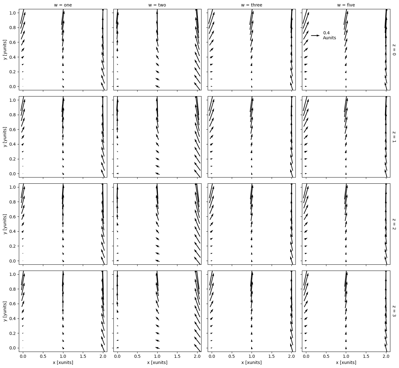
scale is required for faceted quiver plots.
The scale determines the number of data units per arrow length unit, i.e. a smaller scale parameter makes the arrow longer.
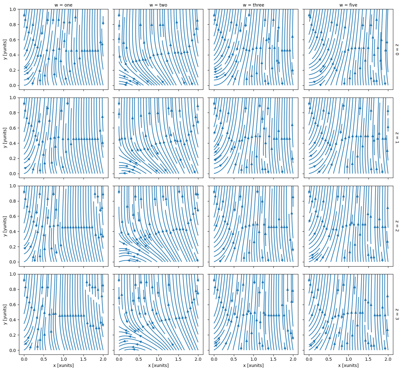
Streamplot#
Visualizing vector fields is also supported with streamline plots:
ds.isel(w=1, z=1).plot.streamplot(x="x", y="y", u="A", v="B");
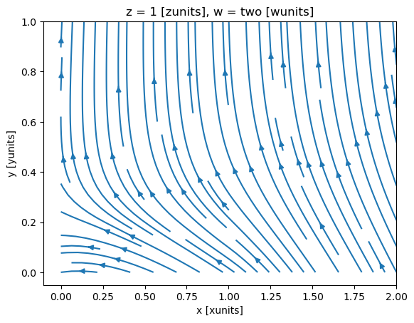
where u and v denote the x and y direction components of the vectors tangent to the streamlines.
Again, faceting is also possible:
ds.plot.streamplot(x="x", y="y", u="A", v="B", col="w", row="z");