Faceting#
Faceting here refers to splitting an array along one or two dimensions and plotting each group. Xarray’s basic plotting is useful for plotting two dimensional arrays. What about three or four dimensional arrays? That’s where facets become helpful. The general approach to plotting here is called “small multiples”, where the same kind of plot is repeated multiple times, and the specific use of small multiples to display the same relationship conditioned on one or more other variables is often called a “trellis plot”.
import matplotlib.pyplot as plt
import numpy as np
import pandas as pd
import xarray as xr

# Load example data
airtemps = xr.tutorial.open_dataset("air_temperature")
air = airtemps.air - 273.15
air.attrs = airtemps.air.attrs
air.attrs["units"] = "deg C"
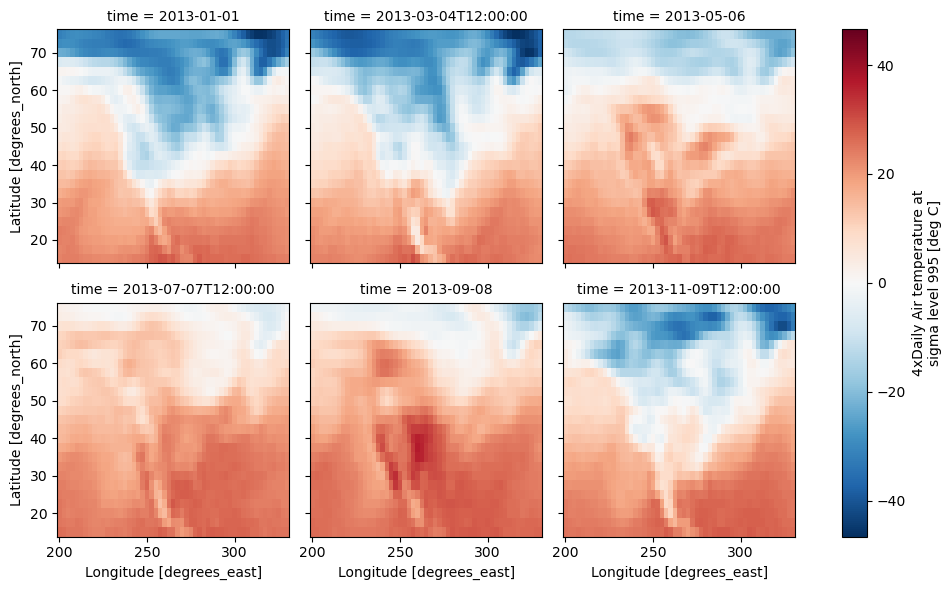
Consider the temperature data set. There are 4 observations per day for two years which makes for 2920 values along the time dimension. One way to visualize this data is to make a separate plot for each time period.
The faceted dimension should not have too many values; faceting on the time dimension will produce 2920 plots. That’s too much to be helpful. To handle this situation try performing an operation that reduces the size of the data in some way. For example, we could compute the average air temperature for each month and reduce the size of this dimension from 2920 -> 12. A simpler way is to just take a slice on that dimension. So let’s use a slice to pick 6 times throughout the first year.
t = air.isel(time=slice(0, 365 * 4, 250))
t.coords
Coordinates:
  * lat      (lat) float32 100B 75.0 72.5 70.0 67.5 65.0 ... 22.5 20.0 17.5 15.0
  * lon      (lon) float32 212B 200.0 202.5 205.0 207.5 ... 325.0 327.5 330.0
  * time     (time) datetime64[ns] 48B 2013-01-01 ... 2013-11-09T12:00:00
Simple Example#
The easiest way to create faceted plots is to pass in row or col
arguments to the xarray plotting methods/functions. This returns a
xarray.plot.FacetGrid object.
g_simple = t.plot(x="lon", y="lat", col="time", col_wrap=3);
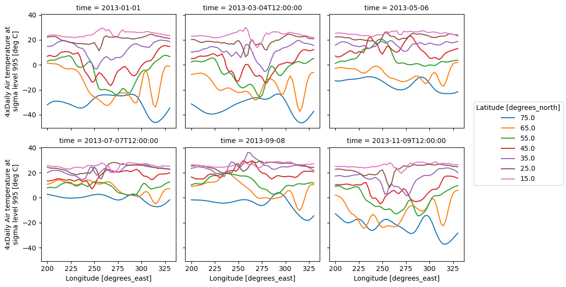
Faceting also works for line plots.
g_simple_line = t.isel(lat=slice(0, None, 4)).plot(
    x="lon", hue="lat", col="time", col_wrap=3
);
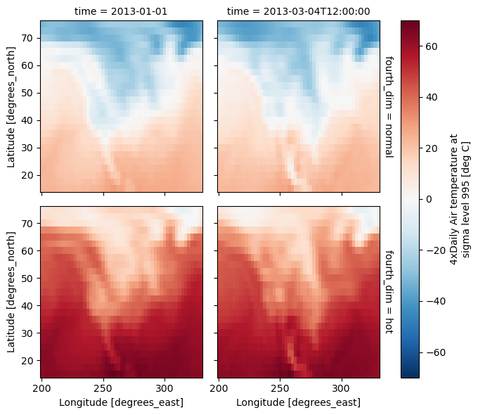
4 dimensional#
For 4 dimensional arrays we can use the rows and columns of the grids. Here we create a 4 dimensional array by taking the original data and adding a fixed amount. Now we can see how the temperature maps would compare if one were much hotter.
t2 = t.isel(time=slice(0, 2))
t4d = xr.concat([t2, t2 + 40], pd.Index(["normal", "hot"], name="fourth_dim"))
# This is a 4d array
t4d.coords

t4d.plot(x="lon", y="lat", col="time", row="fourth_dim");
Other features#
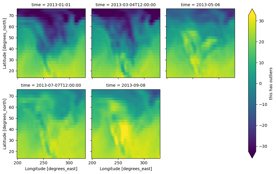
Faceted plotting supports other arguments common to xarray 2d plots.
hasoutliers = t.isel(time=slice(0, 5)).copy()
hasoutliers[0, 0, 0] = -100
hasoutliers[-1, -1, -1] = 400

g = hasoutliers.plot.pcolormesh(
    x="lon",
    y="lat",
    col="time",
    col_wrap=3,
    robust=True,
    cmap="viridis",
    cbar_kwargs={"label": "this has outliers"},
)
FacetGrid Objects#
The object returned, g in the above examples, is a FacetGrid object
that links a DataArray to a matplotlib figure with a particular structure.
This object can be used to control the behavior of the multiple plots.
It borrows an API and code from Seaborn’s FacetGrid.
The structure is contained within the axs and name_dicts
attributes, both 2d NumPy object arrays.
g.axs
array([[<Axes: title={'center': 'time = 2013-01-01'}, ylabel='Latitude [degrees_north]'>,
        <Axes: title={'center': 'time = 2013-03-04T12:00:00'}>,
        <Axes: title={'center': 'time = 2013-05-06'}>],
       [<Axes: title={'center': 'time = 2013-07-07T12:00:00'}, xlabel='Longitude [degrees_east]', ylabel='Latitude [degrees_north]'>,
        <Axes: title={'center': 'time = 2013-09-08'}, xlabel='Longitude [degrees_east]'>,
        <Axes: xlabel='Longitude [degrees_east]'>]], dtype=object)
g.name_dicts
array([[{'time': np.datetime64('2013-01-01T00:00:00.000000000')},
        {'time': np.datetime64('2013-03-04T12:00:00.000000000')},
        {'time': np.datetime64('2013-05-06T00:00:00.000000000')}],
       [{'time': np.datetime64('2013-07-07T12:00:00.000000000')},
        {'time': np.datetime64('2013-09-08T00:00:00.000000000')}, None]],
      dtype=object)
It’s possible to select the xarray.DataArray or
xarray.Dataset corresponding to the FacetGrid through the
name_dicts.
g.data.loc[g.name_dicts[0, 0]]
<xarray.DataArray 'air' (lat: 25, lon: 53)> Size: 11kB
array([[-100.  ,  -30.65,  -29.65, ...,  -40.35,  -37.65,  -34.55],
       [ -29.35,  -28.65,  -28.45, ...,  -40.35,  -37.85,  -33.85],
       [ -23.15,  -23.35,  -24.26, ...,  -39.95,  -36.76,  -31.45],
       ...,
       [  23.45,   23.05,   23.25, ...,   22.25,   21.95,   21.55],
       [  22.75,   23.05,   23.64, ...,   22.75,   22.75,   22.05],
       [  23.14,   23.64,   23.95, ...,   23.75,   23.64,   23.45]],
      shape=(25, 53))
Coordinates:
  * lat      (lat) float32 100B 75.0 72.5 70.0 67.5 65.0 ... 22.5 20.0 17.5 15.0
  * lon      (lon) float32 212B 200.0 202.5 205.0 207.5 ... 325.0 327.5 330.0
    time     datetime64[ns] 8B 2013-01-01
Attributes:
    long_name:     4xDaily Air temperature at sigma level 995
    units:         deg C
    precision:     2
    GRIB_id:       11
    GRIB_name:     TMP
    var_desc:      Air temperature
    dataset:       NMC Reanalysis
    level_desc:    Surface
    statistic:     Individual Obs
    parent_stat:   Other
actual_range: [185.16 322.1 ]Here is an example of using the lower level API and then modifying the axes after they have been plotted.
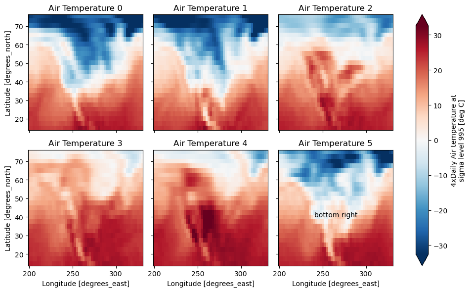
g = t.plot.imshow(x="lon", y="lat", col="time", col_wrap=3, robust=True)

for i, ax in enumerate(g.axs.flat):
    ax.set_title("Air Temperature %d" % i)

bottomright = g.axs[-1, -1]
bottomright.annotate("bottom right", (240, 40));
FacetGrid objects have methods that let you customize the automatically generated
axis labels, axis ticks and plot titles. See set_titles(),
set_xlabels(), set_ylabels() and
set_ticks() for more information.
Plotting functions can be applied to each subset of the data by calling
map_dataarray() or to each subplot by calling map().