Line Plots (1D)#
The following imports are necessary for all of the examples.
import matplotlib.pyplot as plt
import numpy as np
import pandas as pd
import xarray as xr
For these examples we’ll use the North American air temperature dataset.
airtemps = xr.tutorial.open_dataset("air_temperature")
airtemps
<xarray.Dataset> Size: 31MB
Dimensions:  (time: 2920, lat: 25, lon: 53)
Coordinates:
  * lat      (lat) float32 100B 75.0 72.5 70.0 67.5 65.0 ... 22.5 20.0 17.5 15.0
  * lon      (lon) float32 212B 200.0 202.5 205.0 207.5 ... 325.0 327.5 330.0
  * time     (time) datetime64[ns] 23kB 2013-01-01 ... 2014-12-31T18:00:00
Data variables:
    air      (time, lat, lon) float64 31MB ...
Attributes:
    Conventions:  COARDS
    title:        4x daily NMC reanalysis (1948)
    description:  Data is from NMC initialized reanalysis\n(4x/day).  These a...
    platform:     Model
references: http://www.esrl.noaa.gov/psd/data/gridded/data.ncep.reanaly...# Convert to celsius
air = airtemps.air - 273.15
# copy attributes to get nice figure labels and change Kelvin to Celsius
air.attrs = airtemps.air.attrs
air.attrs["units"] = "deg C"
Note
Until GH1614 is solved, you might need to copy over the metadata in attrs to get informative figure labels (as was done above).
Syntax Overview#
There are three ways to use the xarray plotting functionality:
Use
plotas a convenience method for a DataArray.Access a specific plotting method from the
plotattribute of a DataArray.Directly from the xarray plot submodule.
These are provided for user convenience; they all call the same code.
da = xr.DataArray(range(5))
fig, axs = plt.subplots(ncols=2, nrows=2)
da.plot(ax=axs[0, 0])
da.plot.line(ax=axs[0, 1])
xr.plot.plot(da, ax=axs[1, 0])
xr.plot.line(da, ax=axs[1, 1]);
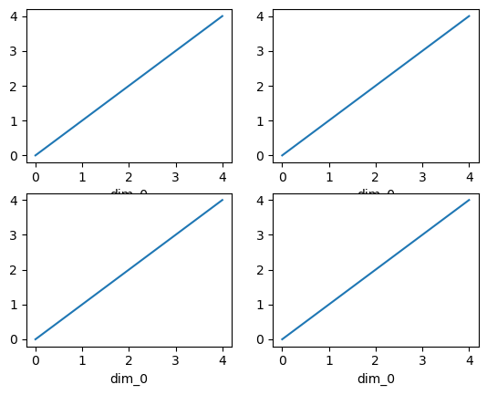
Here the output is the same. Since the data is 1 dimensional the line plot was used.
The convenience method xarray.DataArray.plot() dispatches to an appropriate
plotting function based on the dimensions of the DataArray and whether
the coordinates are sorted and uniformly spaced. This table
describes what gets plotted:
Dimensions |
Plotting function |
1 |
|
2 |
|
Anything else |
Simple Example#
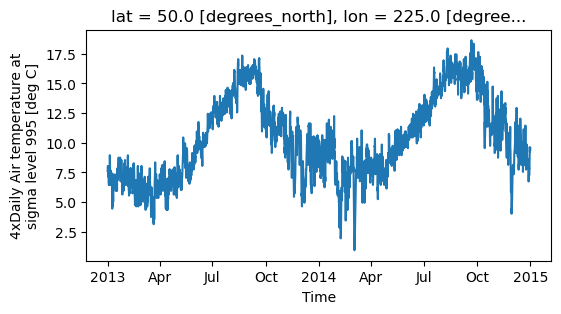
The simplest way to make a plot is to call the DataArray.plot() method.
air1d = air.isel(lat=10, lon=10)
air1d.plot();
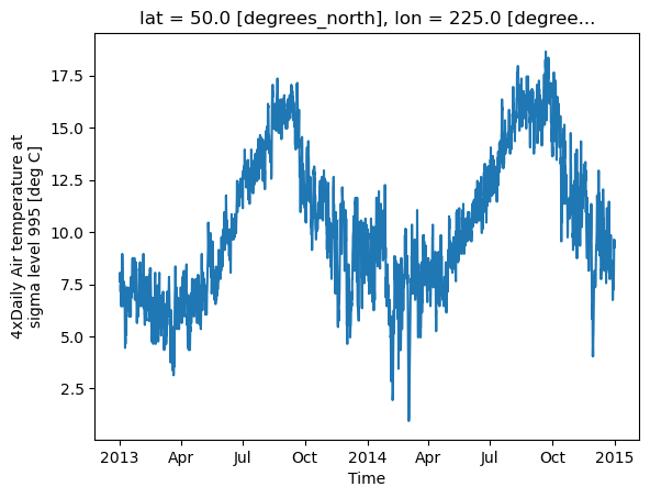
Xarray uses the coordinate name along with metadata attrs.long_name,
attrs.standard_name, DataArray.name and attrs.units (if available)
to label the axes.
The names long_name, standard_name and units are copied from the
CF-conventions spec.
When choosing names, the order of precedence is long_name, standard_name and finally DataArray.name.
The y-axis label in the above plot was constructed from the long_name and units attributes of air1d.
air1d.attrs
{'long_name': '4xDaily Air temperature at sigma level 995',
 'units': 'deg C',
 'precision': np.int16(2),
 'GRIB_id': np.int16(11),
 'GRIB_name': 'TMP',
 'var_desc': 'Air temperature',
 'dataset': 'NMC Reanalysis',
 'level_desc': 'Surface',
 'statistic': 'Individual Obs',
 'parent_stat': 'Other',
 'actual_range': array([185.16, 322.1 ], dtype=float32)}
Additional Arguments#
Additional arguments are passed directly to the matplotlib function which
does the work.
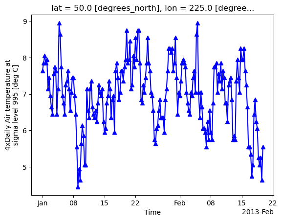
For example, xarray.plot.line() calls
matplotlib.pyplot.plot passing in the index and the array values as x and y, respectively.
So to make a line plot with blue triangles a matplotlib format string
can be used:
air1d[:200].plot.line("b-^");
Note
Not all xarray plotting methods support passing positional arguments to the wrapped matplotlib functions, but they do all support keyword arguments.
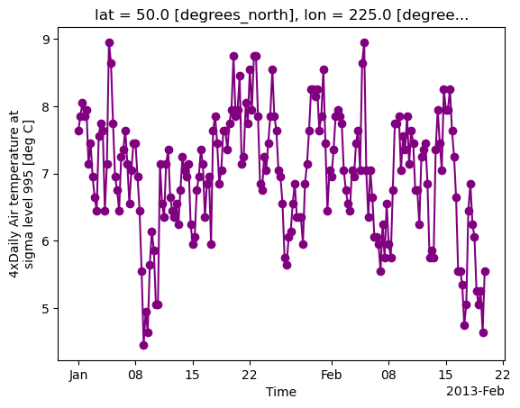
Keyword arguments work the same way, and are more explicit.
air1d[:200].plot.line(color="purple", marker="o");
Adding to Existing Axis#
To add the plot to an existing axis pass in the axis as a keyword argument
ax. This works for all xarray plotting methods.
In this example axs is an array consisting of the left and right
axes created by plt.subplots.
fig, axs = plt.subplots(ncols=2)

print(axs)

air1d.plot(ax=axs[0])
air1d.plot.hist(ax=axs[1]);
[<Axes: > <Axes: >]
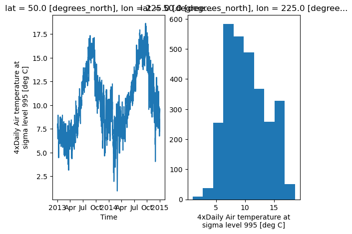
On the right is a histogram created by xarray.plot.hist().
Controlling the figure size#
You can pass a figsize argument to all xarray’s plotting methods to
control the figure size. For convenience, xarray’s plotting methods also
support the aspect and size arguments which control the size of the
resulting image via the formula figsize = (aspect * size, size):
air1d.plot(aspect=2, size=3);
This feature also works with Faceting. For facet plots,
size and aspect refer to a single panel (so that aspect * size
gives the width of each facet in inches), while figsize refers to the
entire figure (as for matplotlib’s figsize argument).
Note
If figsize or size are used, a new figure is created,
so this is mutually exclusive with the ax argument.
Note
The convention used by xarray (figsize = (aspect * size, size)) is
borrowed from seaborn: it is therefore not equivalent to matplotlib’s.
Determine x-axis values#
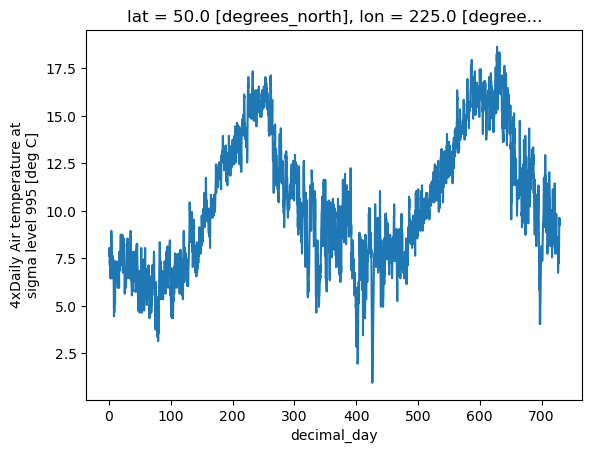
Per default dimension coordinates are used for the x-axis (here the time coordinates). However, you can also use non-dimension coordinates, MultiIndex levels, and dimensions without coordinates along the x-axis. To illustrate this, let’s calculate a ‘decimal day’ (epoch) from the time and assign it as a non-dimension coordinate:
decimal_day = (air1d.time - air1d.time[0]) / pd.Timedelta("1d")
air1d_multi = air1d.assign_coords(decimal_day=("time", decimal_day.data))
air1d_multi
<xarray.DataArray 'air' (time: 2920)> Size: 23kB
array([7.64, 7.85, 8.05, ..., 9.34, 9.34, 9.54], shape=(2920,))
Coordinates:
    lat          float32 4B 50.0
    lon          float32 4B 225.0
  * time         (time) datetime64[ns] 23kB 2013-01-01 ... 2014-12-31T18:00:00
    decimal_day  (time) float64 23kB 0.0 0.25 0.5 0.75 ... 729.2 729.5 729.8
Attributes:
    long_name:     4xDaily Air temperature at sigma level 995
    units:         deg C
    precision:     2
    GRIB_id:       11
    GRIB_name:     TMP
    var_desc:      Air temperature
    dataset:       NMC Reanalysis
    level_desc:    Surface
    statistic:     Individual Obs
    parent_stat:   Other
actual_range: [185.16 322.1 ]To use 'decimal_day' as x coordinate it must be explicitly specified:
air1d_multi.plot(x="decimal_day");

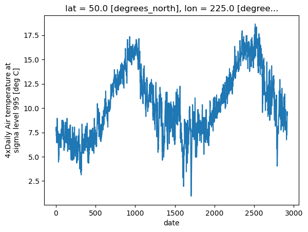
Creating a new MultiIndex named 'date' from 'time' and 'decimal_day',
it is also possible to use a MultiIndex level as x-axis:
air1d_multi = air1d_multi.set_index(date=("time", "decimal_day"))
air1d_multi.plot(x="decimal_day");
Finally, if a dataset does not have any coordinates it enumerates all data points:
air1d_multi = air1d_multi.drop_vars(["date", "time", "decimal_day"])
air1d_multi.plot();
The same applies to 2D plots below.
Multiple lines showing variation along a dimension#
It is possible to make line plots of two-dimensional data by calling xarray.plot.line()
with appropriate arguments. Consider the 3D variable air defined above. We can use line
plots to check the variation of air temperature at three different latitudes along a longitude line:
air.isel(lon=10, lat=[19, 21, 22]).plot.line(x="time");
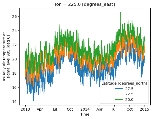
It is required to explicitly specify either
x: the dimension to be used for the x-axis, orhue: the dimension you want to represent by multiple lines.
Thus, we could have made the previous plot by specifying hue='lat' instead of x='time'.
If required, the automatic legend can be turned off using add_legend=False. Alternatively,
hue can be passed directly to xarray.plot.line() as air.isel(lon=10, lat=[19,21,22]).plot.line(hue='lat').
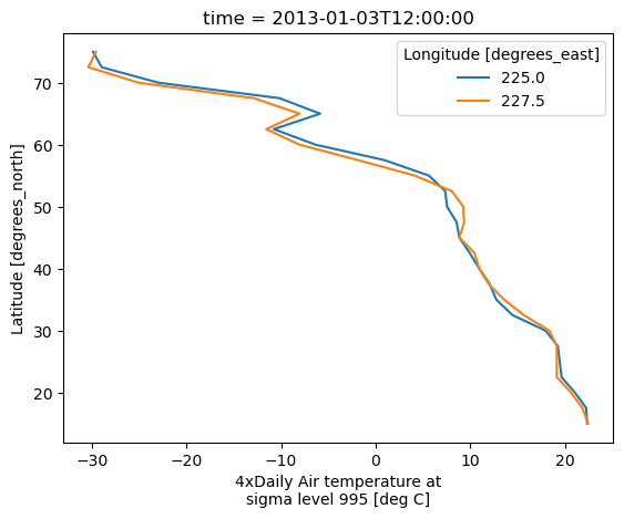
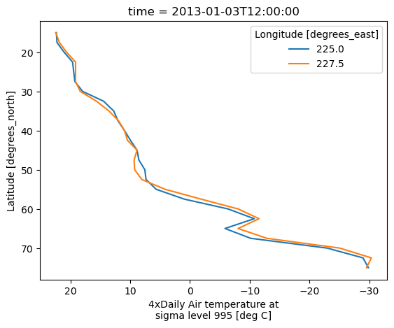
Dimension along y-axis#
It is also possible to make line plots such that the data are on the x-axis and a dimension is on the y-axis. This can be done by specifying the appropriate y keyword argument.
air.isel(time=10, lon=[10, 11]).plot(y="lat", hue="lon");
Step plots#
As an alternative, also a step plot similar to matplotlib’s plt.step can be
made using 1D data.
air1d[:20].plot.step(where="mid");
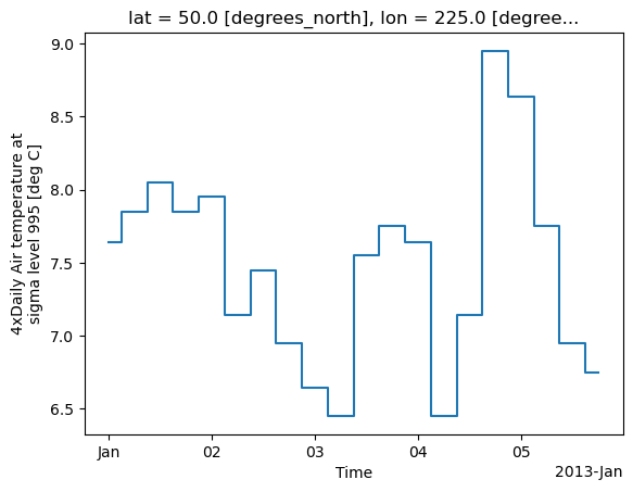
The argument where defines where the steps should be placed, options are
'pre' (default), 'post', and 'mid'. This is particularly handy
when plotting data grouped with Dataset.groupby_bins().
air_grp = air.mean(["time", "lon"]).groupby_bins("lat", [0, 23.5, 66.5, 90])
air_mean = air_grp.mean()
air_std = air_grp.std()
air_mean.plot.step()
(air_mean + air_std).plot.step(ls=":")
(air_mean - air_std).plot.step(ls=":")
plt.ylim(-20, 30)
plt.title("Zonal mean temperature");
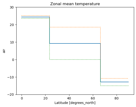
In this case, the actual boundaries of the bins are used and the where argument
is ignored.
Other axes kwargs#
The keyword arguments xincrease and yincrease let you control the axes direction.
air.isel(time=10, lon=[10, 11]).plot.line(
    y="lat", hue="lon", xincrease=False, yincrease=False
);
In addition, one can use xscale, yscale to set axes scaling;
xticks, yticks to set axes ticks and xlim, ylim to set axes limits.
These accept the same values as the matplotlib methods ax.set_(x,y)scale(),
ax.set_(x,y)ticks(), ax.set_(x,y)lim(), respectively.